September 28, 2026 by Debbie Westbrooks
Chalk Couture Transfers With a Watercolor Look
Live Videos · Crafts · DIY
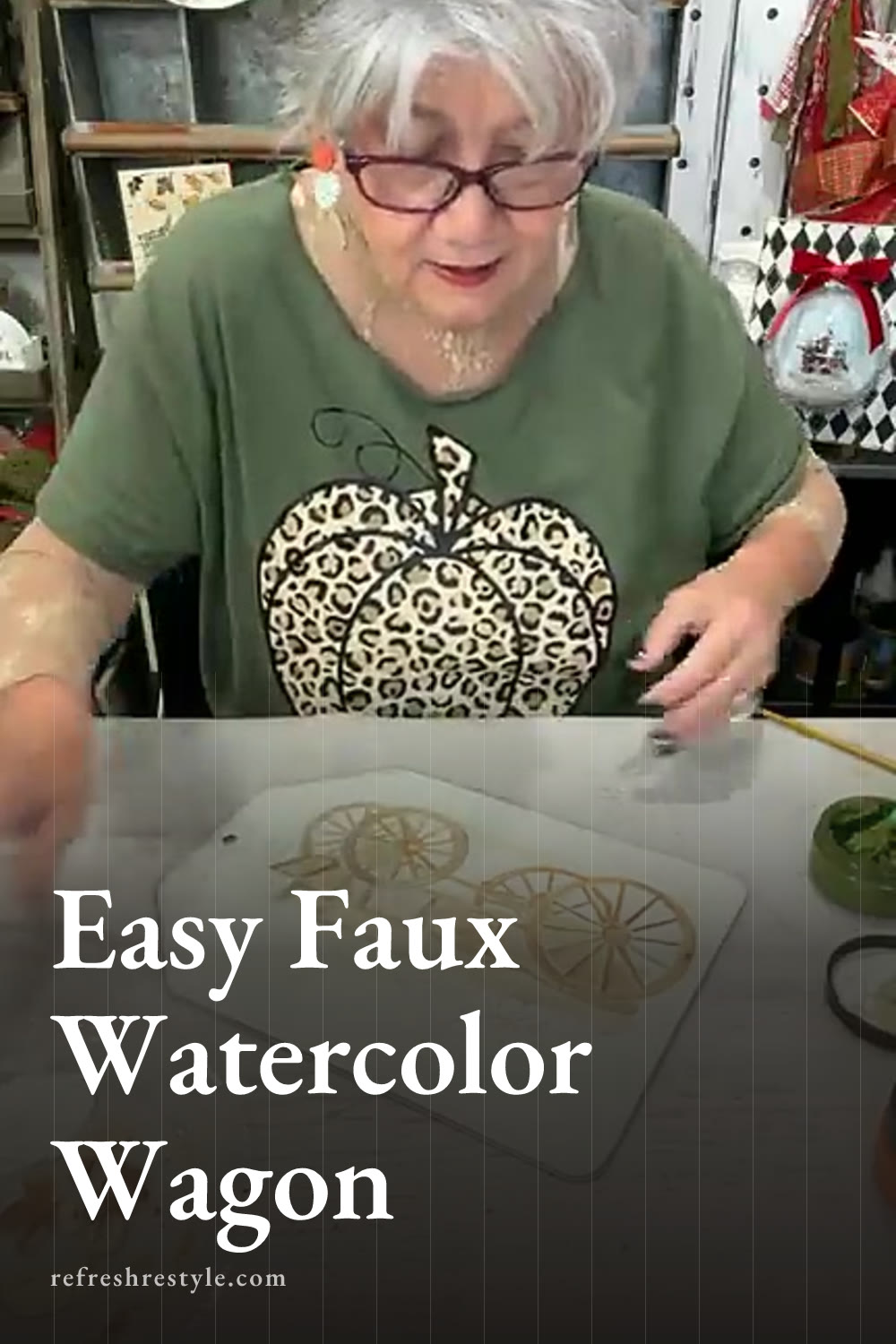
I made a colorful harvest wagon sign on a large tag, and the finished design has the soft variation of a watercolor painting. Chalk Couture transfers made the technique easy because I could add loose layers of color first, then bring every wagon wheel, pumpkin, and gourd back into focus with one final layer.
Preparing the Large Tag
I started with a 9 by 12 tag and painted the front Vanilla using a round sponge. Vanilla is a lovely light color that feels softer than a bright white, so it gave me a warm background for all those fall colors.
After the surface dried, I sanded it lightly and removed the dust. That gave me a smooth base for the transfer. I skipped wax for this project and went straight to placing the design.
Before putting the transfer on the tag, I fuzzed it with a fuzzing cloth. A T shirt works too if you don’t have a fuzzing cloth nearby. The small amount of lint helps reduce the stickiness and makes the transfer easier to lift from a freshly painted surface.
Creating the First Chalk Couture Transfer Layer
The first transfer layer acts like a guide for the watercolor step. I placed the Harvest Wagon transfer on the tag and used Dune over the entire design. Dune is just a little darker than the Vanilla background, which allowed me to see the details without making those first lines too strong.
Once I lifted the transfer, the wagon already looked pretty in that soft neutral color. The light design gave me clear areas to paint while still allowing plenty of freedom with my brush.
I scraped the extra paste back into the container, then cleaned the transfer right at my work table. I wet the transfer, wiped away the paste with a microfiber cloth, and used a board eraser to finish cleaning the open areas. Holding the transfer up to the light made it easy to check my progress. When I could see through every part of the design, I laid it aside to dry with the sticky side facing up.
Mixing the Faux Watercolor Colors
I used a plastic plate as my palette and gathered several small paintbrushes in different sizes. Regular craft brushes worked well for this. A smaller brush gives you more control around the pumpkins and narrow wagon details, while a slightly larger one helps fill the broader wood panels.
I started with Espresso and sprayed it with a little water. The goal was a thin, watery brown that would move across the surface easily and create lighter and darker areas.
I painted the wagon wheel and wood panels first. Some areas received more color, while others stayed light or showed a little of the Vanilla background. That variation is what gives the finished project its painted look.
I also mixed Espresso with Dune and Vanilla to make several brown shades without opening a long list of colors. By dipping into brown, water, and a lighter color in different amounts, I could change the shade as I worked.
The painted layer looked loose during this part, which is exactly what I wanted. The final transfer layer would add all the crisp details later.
Painting the Pumpkins and Gourds
For the pumpkins, I used Papaya mixed with water. I varied the amount of water and added Vanilla or Dune in places to create several shades from the same orange color. A little extra color along the edges helped suggest the rounded pumpkin shapes.
Next, I moved into Pesto without fully cleaning all the Papaya from my brush. That little bit of color mixing created another natural variation, and it helped the green blend with the rest of the fall palette.
I painted a few green pumpkins and gourds, then added Pesto to the stems. I also let a little green overlap some of the orange areas because pumpkins fresh from the field often have a mix of colors.
You can paint every open space or leave parts of the background showing. I worked fairly quickly and focused on adding loose color rather than making every edge exact. The transfer takes care of the fine lines during the next step.
Adding the Final Espresso Details
I dried the painted design completely before placing the clean transfer back on the tag. This step matters because a dry surface protects the painted colors and helps the transfer sit flat.
The original Dune image made alignment easier. I moved the transfer gently until the wagon, wheels, pumpkins, and stems lined up with the first impression, then pressed it down.
For the second layer, I spread Espresso over the full design. A dark brown gave me plenty of contrast while keeping the warm fall look. Black would also create a stronger outline if that better suits your decor.
When I lifted the transfer, the difference was amazing. The Espresso restored all the little lines and details, and the loose painted areas suddenly looked like a finished watercolor. Even the sections with uneven color or small gaps worked once the dark outlines framed them.
Finishing the Harvest Wagon Sign
I finished the tag with a fall bow using Farmers Market ribbon, green ribbon, and a little black. I like adding a touch of black to my projects because it connects nicely with the deeper colors in the design.
The tag shape makes this easy to hang for fall and Thanksgiving. You could also add magnets to the back and place it on a larger magnetic surface, which would give you another way to work it into your seasonal decor.
Chalk Couture supplies I used
You can shop my full Chalk Couture store here.
I am an independent Chalk Couture designer, so I earn a commission on these links. See my disclosure for more.