September 1, 2026 by Debbie Westbrooks
Chalk Couture Fall Welcome Door Round
Live Videos · DIY · Home Interior
I turned the back of one of my favorite summer door rounds into a warm fall welcome sign using Chalk Couture transfers, layered paste colors, a field of pumpkins, and a big ribbon bow. Now I have summer on one side and fall on the other, which gives me two seasonal looks without finding space to store another sign.
Refreshing a door round I already had
I found this summer door round while I was going through my craft room, and I decided the unfinished back was the perfect spot for a fall design. Using both sides of a wood sign is such a practical way to get more from what you already have.
If you have an older door round with a design you no longer love, you can lightly sand it and paint over it. Mine still has one of my favorite watermelon designs on the front, so I left that side alone and worked on the back.
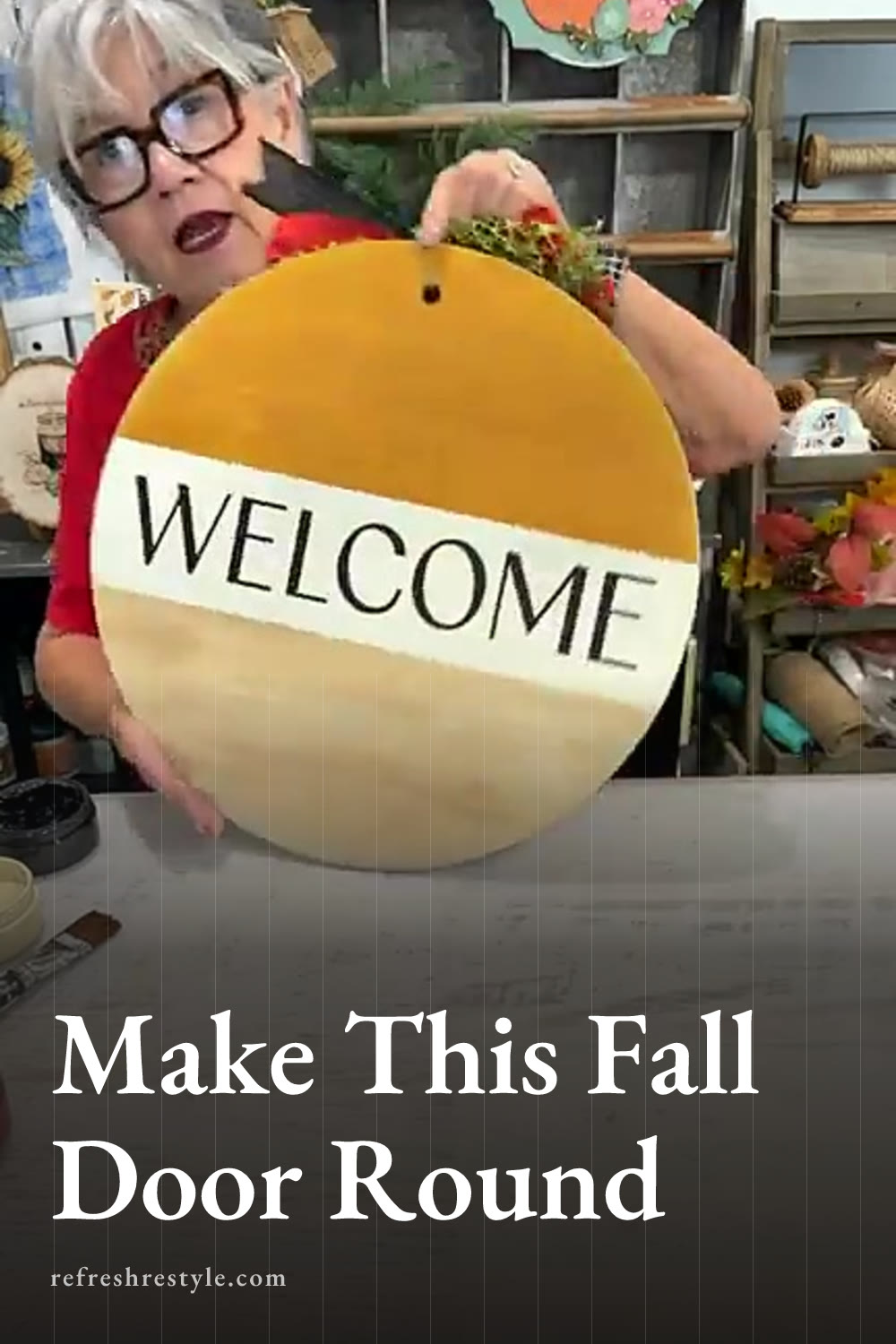
I divided the round into three sections with tape. The pumpkins would go across the bottom, the Welcome design would sit in the middle, and the bow would fill the top. Breaking the surface into sections gave me room to play with several fall colors without making the finished sign feel too busy.
Painting the fall background
Mixing the bottom colors
For the bottom section, I painted with paste and used a wet brush to help it move across the wood. Chalk Couture paste paints beautifully, especially when I have jars that are getting close to empty and I want to use every bit.
I started with Vanilla, then dabbed in Camel and Dune. I moved the brush here and there instead of blending everything into one flat shade. The mix looked a little like caramel and gave the bottom a warm, earthy background for the pumpkins.
One coat covered nicely. I wanted some variation and a slightly worn look, so perfect coverage wasn’t my goal.
Painting the middle and top
I painted the middle section with Vanilla. I brushed all the way across the round so the strokes traveled in one direction rather than stopping in the middle.
For the top, I chose Butterscotch. I mixed in a little Vanilla and let a few lighter streaks remain because they broke up the solid color and made the finish look intentional. Butterscotch felt just right for fall and worked well with the colors I planned to use in the pumpkins.
Once the paint was dry, I lightly sanded the surface. This smoothed the painted sections and added a little distressing around the round. I cleaned away the dust and applied wax before moving on to the transfers.
Adding Chalk Couture transfers
Creating the Welcome design
I placed the reusable Welcome transfer across the Vanilla section. Before putting it on the board, I fuzzed it with a fuzzing cloth. A clean T shirt also works when you don’t have the cloth nearby.
I applied Black paste with a mini squeegee because I wanted the word to stand out against the light background. After covering the design, I pulled away the extra paste and lifted the transfer.
The black lettering gave the sign a strong center and tied in with the black ribbon I planned to use. The Welcome transfer works for any season, so I can use it again for Christmas, spring, team colors, or another everyday door sign. After cleaning it, it’s ready for the next project, and these transfers can be reused dozens of times with proper care.
Making colorful fall pumpkins
I placed the pumpkin design across the bottom section and used a hot mess technique with several colors. I added Dune, Papaya, orange, Cherry, Butterscotch, and a little Black directly over different parts of the design.
Then I used a larger squeegee to move the colors across the pumpkins. They mixed as I worked, but each color still showed in places. That variation made the pumpkins feel playful and helped them coordinate with the painted background.
I added more Black than I originally planned, but it worked once I saw the finished design. The black details connected the pumpkins to the Welcome lettering and the ribbon. When you use this technique, start with smaller amounts of the darkest color since it can spread quickly.
I lifted the transfer slowly from one side. Pulling it up a little at a time lets you check for any missed areas, and you can place it back down before the whole transfer comes away.
Making the stacked fall bow
I mixed three ribbon patterns for the bow. One had a pretty fall print, one added black, and another was a little plainer. Mixing patterns worked because the colors repeated what I had already used on the sign.
To make each layer, I cut a length of ribbon and folded it into an awareness ribbon shape. Then I brought the top loop down over the crossed section. I repeated that with the other ribbons, making each layer the same size or slightly smaller.
I pinched every ribbon in the middle and stacked the layers together. Once I had them gathered, I tied the center securely. The bow looked flat at first, so I separated the loops, pulled the tails down, and fluffed each layer until all three patterns could be seen.
I added a small burlap looking piece in the center for a little more fall texture, then attached the finished bow at the top with hot glue. I considered adding greenery, but the full bow gave the sign enough detail.
A reversible sign for two seasons
The finished round has warm painted sections, crisp black lettering, colorful pumpkins, and a big bow that brings all the colors together. When I want my summer watermelon design, I can flip it around and press the bow out of the way. When September arrives, the fall side is ready for the door.
This same idea would work well with fall and Christmas designs or any two seasons you enjoy decorating for. Using both sides also means fewer large signs taking up storage space, and I can refresh either surface later with light sanding and a new coat of color.
Chalk Couture supplies I used
You can shop my full Chalk Couture store here.
I am an independent Chalk Couture designer, so I earn a commission on these links. See my disclosure for more.